Time-Series Maps: Model-based Estimates of Cancer Incidence
This application is an interactive digital map animation that allows users to view model-based county-level cancer incidence rates over time. Based on data from the NAACCR CiNA research database from 2005 to 2019, spatio-temporal hierarchical Bayesian models are developed to smooth or predict age-group-specific counts for all U.S. counties annually, with Alaska treated as a single geographic unit. Age-adjusted rates were then produced, based on the modeled counts from the finally selected model, for 16 selected sex-specific cancer sites, representing a wide range of cancer sites varying from more common to rarer. Details on the methodology were given in Liu et al., 2026. Presented here on this website are the county-level model-based age-adjusted incidence rates for the 16 selected cancer sites except female eye & orbit. Estimates for additional cancer sites are being developed.
With the Time-Series Maps you can:
- Choose from a selection of cancer sites to see incidence rates at US County level.
- Identify regions by clicking the map for rate over time charts.
- Extract the map by saving an image or downloading the statistics in a delimited format for further analyses in other software.
Data
The cancer sites available on this website are defined using the SEER Site Recode ICD-O-3/WHO 2008 variable. These model-based estimates of cancer incidence provide access to county-level estimates of age-adjusted cancer incidence rates from 2005 to 2019 for the following selected sites:
Female:
- Female All Cancers
- Brain and ONS Cancer
- Breast Cancer
- Cervix Cancer
- Lung and Bronchus Cancer
- Stomach Cancer
- Thyroid Cancer
Male:
- Acute Lymphocytic Leukemia
- Bones and Joint Cancer
- Non-Hodgkin Lymphoma
- Melanoma of the Skin
- Oral Cavity and Pharynx Cancer
- Multiple Myeloma
- Penis Cancer
- Prostate Cancer
Visualization


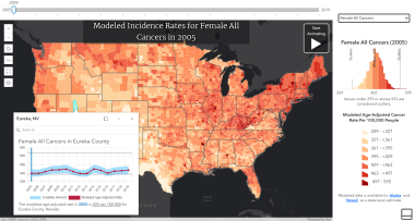
Time-Series Maps: Model-based Estimates of Cancer Incidence displays data for the entire time-period on a single equal-interval class breaks scale.
The intervals are calculated by first excluding statistical outliers evaluated at three times standard deviation above and below the median. Then seven equal-interval ranges are created from the remaining values with a corresponding color assigned to each.
Finally the highest and lowest groups are expanded so that the outlier values can be displayed on the map. These groups are shown in the map legend and are maintained as the animation advances over years.
A histogram visualization of the data is also available showing the distribution of data within the equal-interval groups. The histogram is updated to represent the currently selected year of data and will change as the map animates.
The histogram displays the minimum, midpoint, and maximum values for the entire dataset on the bottom axis. It identifies the outlier thresholds as well as the current year's average rate with vertical call-outs.
Reference
Liu B, Wang Z, Feuer EJ, Tatalovich Z, Cucinelli J, Lyman J, Sherman RL, Zhu L. Spatio-temporal modeling approach to mapping geographic and temporal variation in cancer incidence rates for U.S. counties, Cancer Epidemiology, Biomarkers & Prevention, 2026, https://doi.org/10.1158/1055-9965.EPI-25-1129.