Animated Historical Cancer Atlas
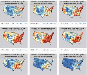
The Animated Historical Cancer Atlas is a tool that allows the users to animate smoothed age-adjusted death rates over time and view them at the national or state level.
The death data are from 1971-2015.
Age-adjusted death rates for 5 year groups were calculated using SEER*Stat by cancer site, sex, and Health Service Area. These rates were then smoothed using the Head-Bang algorithm.
There are PDFs and JPGs that are available for download.
The entire time period can be animated by clicking the orange Animate button at the top of the map display.